The Blog
Under the Covers
For the past month I’ve been working with designers at Pen-L Publishing to create a cover for my novel Surface and Shadow. Trying to envision how my first published novel will look in readers’ hands is fun and exciting, but it’s also challenging. I spent years writing the novel, and now that it’s time to put a face on it, not just any face will do. It has to be the best face possible. So what is that?
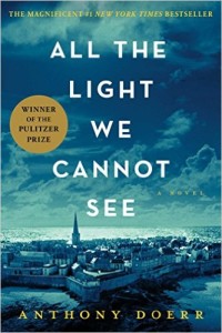
 To learn more about book covers, I studied some of my favorites. An eye-catching cover that I see every day because it’s at the top my to-be-read pile graces the front of All the Light We Cannot See by Anthony Doerr. The boldness of the title type and the mystery of the art behind it pull me in every time. I want to know what’s going on in that strange dark city beneath those ominous clouds. I know this book is excellent, but even if I didn’t, I would probably read it anyway because of the clever title and the appealing cover design.
Another cover I like a lot was created for The Lost Saints of Tennessee.  I like this design because it has life and energy and gives the reader a hint of what the book is about. In an interview soon after Lost Saints was published, author Amy Franklin-Willis talked about how important the cover was to her and how she wanted it to show the relationship between Zeke, one of the novel’s narrators, and his twin brother, Carter. I think this cover nails the relationship in a single image.
For simplicity, my favorite design is the cover of Admission by Jean Hanff Korelitz. A single strand of dark green ivy crossing two tar-black pillars to form the letter “A” becomes a startling symbol of more than one of the novel’s important themes. Plus, the contrast of the dark image against a pale yellow background makes the cover stand out.
 So, I asked myself, what do these covers have in common? Why do I like them all? First and foremost, I’d say, they get the reader’s attention. They’re intriguing, interesting, or startling.
Also, through the lines of the art or the contrast of the colors, they direct my attention to the title of the book. If you look carefully at the boy on the left on the cover of The Lost Saints of Tennessee, his hand points directly toward the title. On the cover of All the Light We Cannot See, the church steeple points to the title. The typography on each of the covers makes the title easy to read, so the cleverness of the words isn’t lost in trying to decipher them.
Each cover says something about the novel, and each is simple enough to look good in both large and small sizes.
Fortuntately, the cover for Surface and Shadow is coming along well. The Pen-L designers have lots of good ideas, and they’re patient with me while accepting my input. I have no doubt we will find the best cover for my work, and that makes me happy. Book covers are important. We all say we don’t choose to read books because of their covers, but we do. I do. Unless I’ve read a review or gotten a recommendation from a friend, my first impression of a book comes from its cover. And if the cover doesn’t get me to open the book and begin to read, then all the writer’s work is for naught.
What do you think makes a good book cover? What are some of your favorite covers?
Tags: book covers, novels, Surface and Shadow
Get in Touch
Follow on Facebook
Follow on Twitter
___________________________________________________
Website Design by Eliza Whitney
 Posts from Late Last Night Books


4 Comments
Sally, Danny here, most of my reading is non-fiction; history, biographies, econ. etc so covers matter very little. However when I do go looking for a novel and inasmuch as I am not familiar with all the current “hot authors” covers do matter. So just glancing at the three shown, I would go first to the dark picture of the town as, like you, I want to know what’s going on there. Looks like a good suspense story. Second would be the picture of the boys as that looks like a story worth reading. The “A” never. Looks to esoteric and I am probably getting on a flight and just want to relax with a good story. Good luck on this. You know I am waiting to read your novel
Thanks for your feedback, Danny. It’s really interesting to see how different book covers affect people. The Admission cover is more symbolic, so I understand your reaction to it. The others, of course, are realistic–actual photographs. I’m glad you’re looking forward to my novel. I think you’ll like its cover.
Hi Sally. Wilson Royall. Also know as Willie Sue, of your high school past. I read several books a week and have followed your novel release with interest and fascination ( I know this person ). Danny forwarded me your blog info during the high school reunion process. The cover does matter!!! I choose many of my books by the cover alone. I’ve read the books you referenced in your selection process, but must say I never saw what you did in those covers alone. I’ll pay more attention in the future. Best wishes to you and your book release. I’m ready to read.
Hi, Wilson. I remember you and I talked about books at the EHS 2010 reunion on Main Street, so I know you’re an avid reader. What are some of your favorite novels? I don’t know the exact release date for my novel yet, but I’ll let you know as soon as I do. I’m so glad you want to read it.